seele - Standard Extensible Elements


https://tideover.cc/seele/ docs/
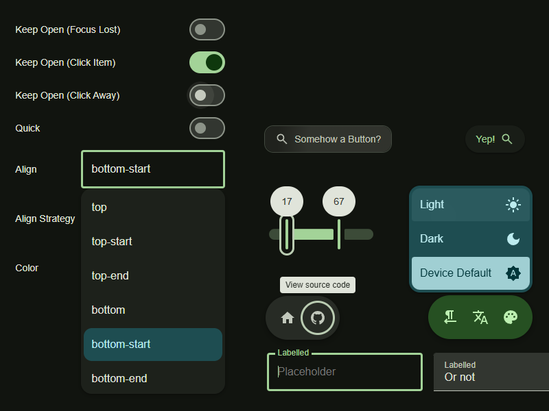
seele (Standard Extensible Elements) is an extensible Web Components library with a focus on accessibility and keyboard-control.
It also provides styled components in the following design guideline(s):
- Material You Expressive
- Windows 98, most styles are from 98.css
Features
What’s the differences comparing to other projects?
- Accessible and keyboard-accessible - all components are based on the APG Patterns
- Flexible - seele provides not only the styled components, but also the base ones and the mix-ins that compose them, allowing you to write your components easily
- Up-to-date - seele uses new Web features as much as possible, (see the README), meaning that its size is relatively small and the compatibility is not the best
Documentations
Download
Browser Support
seele relies on the folling modern web standards:
| feature | baseline | Chromium | Firefox | Safari |
|---|---|---|---|---|
ElementInternals | 2023 | - | - | - |
:dir() | 2023 | 120 | - | - |
| Constructable Stylesheets | 2024 | - | 126 | - |
:state() | 2024 | 125 | 126 | - |
@starting-style | 2024 | - | - | 17.5 |
aria*Element and similar | 2025 | 135 | 136 | 16.4 |
| Popover API | 2025 | - | - | 17 |
CSSNumericValue | not yet | - | Nightly | - |
* CSSNumericValue is worked around currently so it does not raise the minimum
version of Firefox
All of the above result in the following minimum requirements:
- Chromium: >= 135
- Firefox: >= 136
- Safari: >= 17.5
It is 2026 now, so you don’t really need to worry about this. However, in the future, the following web features might be used and require higher browser versions:
anchor()- Baseline 2026, Firefox 147, Safari 26, will remove the dependencyfloating-dom
* omitting a specific browser version means using that standard does not raise the minimum required version of seele
Similar Projects
- Material Web - similar to seele, this project uses Lit but is dedicated to Material Design instead of a generic library and developed by Google developers
- M3E - also built on Lit and has a rather complete component collection
- MUI (Material UI) - tried-and-tested React component library, supporting only Material Design 2
- Vuetify - tried-and-tested Vue component library, supporting only Material Design 2
- MDUI - Lit, Material Design 3, not much accessible but definitely complete